
From Multiple SKUs to One Packaging System
From Multiple SKUs to One Packaging System
A perfume collection is not a row of independent bottles. It is a network of interfaces in which a millimeter, a finish revision, a pump choice or an artwork file can change the assembled result across every SKU.
The customer’s initial request sounded straightforward: develop a consistent packaging family for a collection containing several fragrances, capacities and visual variants. The bottles needed to feel related on shelf. Black and white editions had to carry the same brand authority. Metallic details needed to read as one gold. The pumps, collars and caps had to fit without producing different heights or visible gaps. Artwork had to change from fragrance to fragrance without shifting the logo system. Minimum orders and tooling investment had to remain commercially supportable.
None of those requirements was unusual by itself. The difficulty came from their combination. One bottle size can be reviewed as a product. A collection must be reviewed as a system, because each additional capacity, color and artwork increases the number of physical and administrative relationships that must remain correct.
The project therefore began with a change in framing. DAXIN was not asked merely to manufacture several glass perfume bottles. The development task was to decide where the brand needed visible variation, where common components would reduce risk, and how every approved decision would be transferred into sampling, purchasing, production, quality control and export packing.
For clarity, the diagrams on this page use a planning model with multiple capacities, black, white and clear finishes, several artwork files and a shared closure family. These illustrations explain the control logic; they are not disclosed customer specifications. The exact number of SKUs, selected materials, tooling route and development history must be matched to one documented DAXIN project before publication.
A premium collection with more interfaces than products
The fragrance company was preparing a collection intended to communicate one brand identity across different scent stories. The creative direction used a disciplined rectangular bottle, controlled shoulders, substantial glass, quiet matte surfaces and restrained metallic accents. Capacity and artwork would vary; the visual grammar should not.
The brief arrived with useful brand decisions but incomplete production logic. Reference images showed the intended relationship between bottle and cap. Digital color values described black, white and gold. Artwork files established fragrance names and front/back copy. Yet the neck finish, pump family, installed height, collar construction, cap retention, coating limits, decoration field, carton architecture and SKU-level revision system were not fully connected.
The first review therefore separated consumer-facing choices from system-facing choices. Capacity, fragrance name and selected finish could support consumer differentiation. Neck geometry, pump platform, actuator style, collar envelope, cap interface and approval method were candidates for standardization. The team’s job was not to eliminate variation. It was to place variation where it created brand value and remove it where it created only cost or uncertainty.
This distinction changed the sequence of work. Rather than quote each visible SKU as a separate product, DAXIN’s project management process could be applied to one matrix: bottles across capacities, finishes across materials, artwork across fragrances, components across suppliers and milestones across a shared launch schedule. The package would be approved both vertically—each SKU from bottle to box—and horizontally—every size and finish compared against the rest of the family.
Why packaging complexity grows faster than SKU count
Adding one fragrance does not add only one artwork file. It can add a new front name, back copy, regulatory panel, carton print, barcode, inventory position, quality reference, packing-list line and pallet location. If the new fragrance also uses another capacity or color, it touches coating, decoration, bottle planning, protective packing and approval samples. The visible SKU is only the final node in a larger control network.
Consider a planning model with three bottle capacities, black and white coated editions, a clear edition, several front and back artworks, a pump, collar, cap and outer box. The theoretical number of combinations is not the production plan; brands usually release only a selected subset. But every allowed and forbidden combination must be understood. Otherwise a correct gold cap may be packed with the wrong bottle, a 50 ml artwork may be placed on the 100 ml decoration field, or a pump with the correct neck may receive the wrong dip-tube length.
The growth is faster than linear because risks exist at interfaces. Three capacities create three bottle drawings, but they may also create three cap-gap conditions, three decoration fields, three carton dimensions and three stability behaviors. Two colors create two coating standards, but side-by-side comparison introduces a third question: do both finishes express the same level of premiumness? Four artworks create four files, yet revision control must also prevent cross-assignment among bottle sizes and colors.
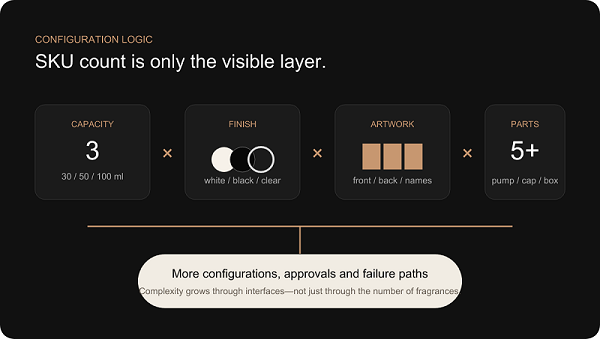
Configuration logic. Complexity grows through interfaces between sizes, finishes, artworks and components—not only through the number of fragrances.
Create the packaging architecture before multiplying SKUs
Packaging architecture defines the stable rules beneath the collection. It answers which decisions are shared, which can vary, which dimensions control downstream parts and which physical references govern appearance. It is the packaging equivalent of a brand design system: restrictive where inconsistency would be expensive, flexible where differentiation has meaning.
The architecture review began at the bottle but did not end there. Bottle design language covered the body-to-shoulder transition, base expression, corner radii and neck-to-body ratio. The neck decision established the pump interface. The pump family influenced installed height, actuator, collar and cap cavity. The cap controlled the perceived width of the closure and the carton insert. Decoration rules established logo zones, metallic relationships and minimum clear space. Carton architecture inherited final dimensions and SKU identity.
Standardization did not mean every bottle looked identical. A 30 ml bottle could use a slightly higher neck-to-body ratio than a 100 ml bottle. A black edition could require different logo contrast from a clear edition. The standard was the design logic: related shoulders, a stable base language, common closure proportions, one gold intent and a consistent logo-position rule. The variation was the controlled response to capacity, substrate and artwork.
The strategic value was cumulative. One pump platform reduced compatibility questions and simplified spare-component planning. A common cap envelope reduced visual drift. Shared carton construction principles made structural development more predictable even when dimensions changed. One approval hierarchy reduced debates about which photograph or email attachment represented the latest decision.
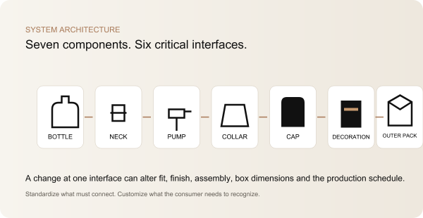
Packaging architecture. Every arrow is an interface that must be owned, dimensioned and verified.
Three capacities cannot be created by pressing “scale”
A computer can reduce a 100 ml drawing to 50 ml and 30 ml with perfect mathematical similarity. The result may still fail as a bottle family. Human perception does not evaluate proportions as ratios alone. A neck that feels controlled on the large bottle can dominate the small bottle. A base that communicates weight on the hero size can consume too much visual area on the travel size. Shoulder radii that hold a clean highlight at 100 ml may look soft when reduced.
Capacity also comes from internal volume, not only exterior scale. Base thickness, wall distribution, push-up, shoulder fullness and neck geometry all affect capacity and weight. If every outside dimension is reduced equally, glass distribution and manufacturing feasibility do not automatically remain equivalent. The 30 ml bottle may need a deliberately adjusted shoulder or internal base profile to retain the family character without forcing an impractical section.
DAXIN’s bottle-family review therefore treated each capacity as a sibling with a common design language, not as a miniature clone. The body width-to-height relationship, shoulder break, base expression and closure envelope were compared in front, side and three-quarter views. Decoration fields were overlaid to see whether the logo occupied the same perceptual zone. Bottle stability and standing surface remained technical constraints, while the visible glass mass remained a brand constraint.
Manufacturing review protected that hierarchy. Controlled corner radii supported mold release and repeatable highlights. The transition into the base was evaluated for glass flow rather than drawn as an arbitrary thick block. The neck/body relationship was coordinated with the closure system before the mold route was frozen. This is where perfume bottle mold development becomes a system decision rather than a single drawing purchase.
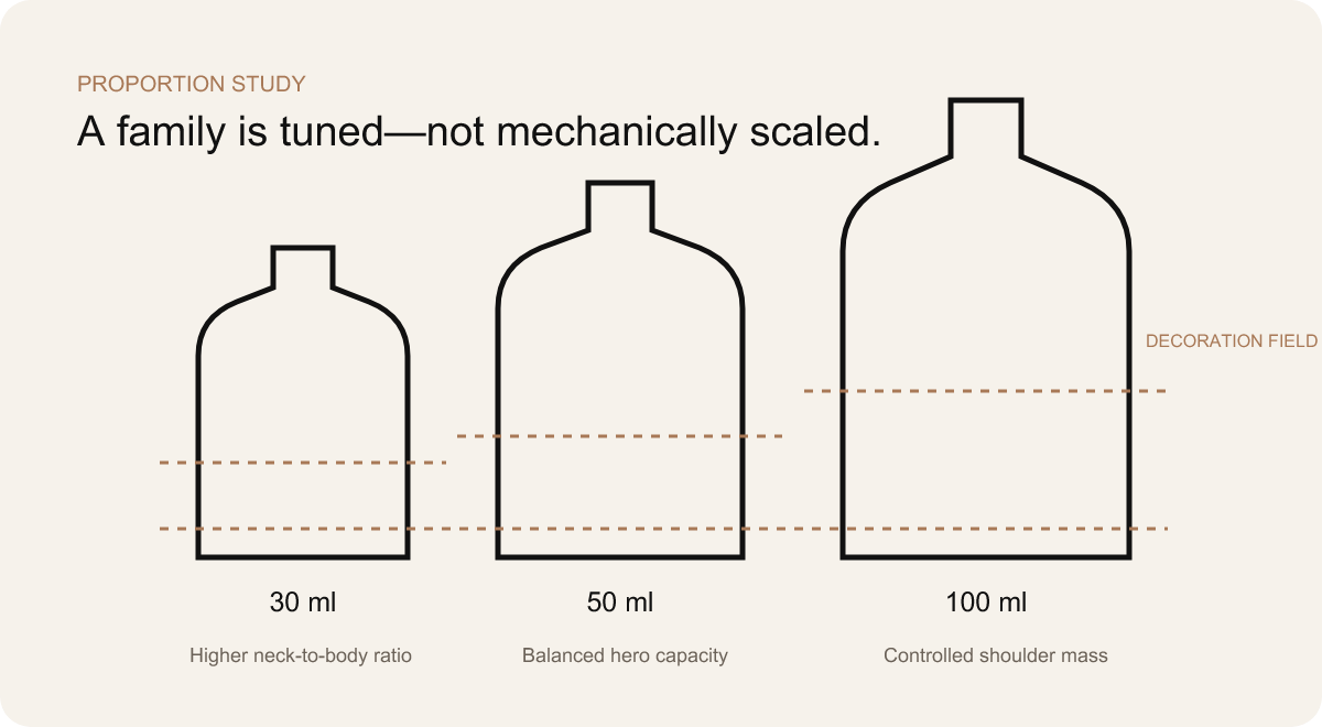
Capacity-specific tuning. The neck-to-body ratio, shoulder mass, base and decoration field are adjusted deliberately for each size.
Standardize the neck, pump and closure system where possible
The closure system is where visible design meets filling-line reality. A perfume pump is not selected after the bottle and cap are finished; it sits between them and defines both interfaces. The neck must accept the pump. The installed pump height controls the collar. The actuator must operate freely. The cap must retain correctly without touching the actuator. The assembled closure must sit straight and create the intended visual gap above the shoulder.
For a crimp-neck perfume bottle, the glass finish has no screw threads. A metal pump cup is mechanically crimped around the defined glass neck profile, compressing the sealing system against the bottle. Showing a threaded neck in a crimp assembly would be technically wrong. If a screw-neck route is selected instead, the bottle, pump and filling operation follow a different interface and assembly method. The project specification must name the actual route; the words “standard neck” are not enough.
Where capacities and fragrance delivery requirements allowed, a common perfume spray pump family reduced variation. That did not mean one identical finished pump could be dropped into every bottle without review. Dip-tube length remained capacity-specific. Tube cut, curvature, dosage, gasket compatibility, installed height and filling-line handling still required definition. Commonality simplified the platform; it did not remove validation.
The actuator and collar were treated as visible engineering. A small change in pump height can expose the collar beneath the cap. A thick decorative collar can reduce internal cap clearance. A magnetic cap may introduce orientation and magnet-position questions. A friction-fit insert can feel loose on one tolerance condition and excessively tight on another. These are not cosmetic problems added at the end. They are functions of the system selected at the beginning.
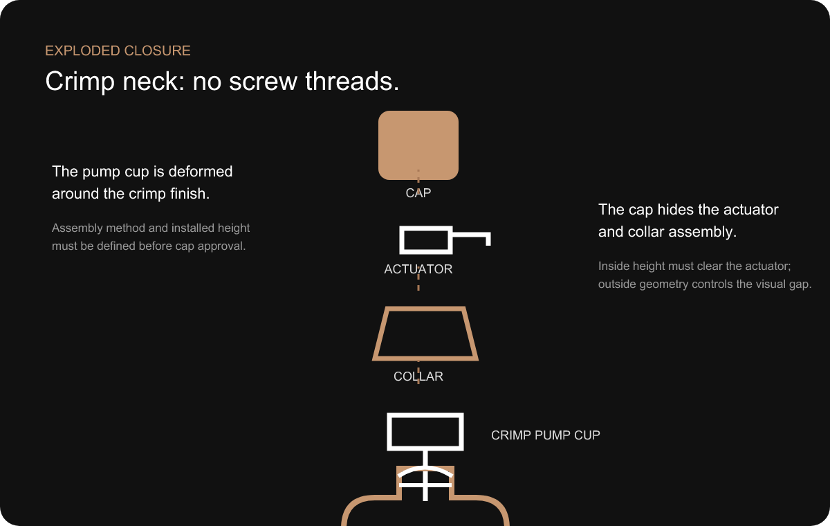
Technically accurate crimp assembly. The pump cup forms around a threadless crimp finish; collar and cap dimensions are verified after installation.
DAXIN’s existing pump, collar and custom closure options provide the sourcing context, but the case-study decision remains specific: a component becomes suitable only when its interface, appearance, quantity and production route work with the whole family.
The tolerance stack-up problem buyers can see and feel
Every manufactured component has permitted dimensional variation. The bottle neck can be slightly high or low within its specification. The pump can install at a range of heights. The collar and cap cavity also vary. Each part may pass its individual inspection, yet their combined high or low conditions can create an assembled package that looks wrong or functions poorly.
This is tolerance stack-up in buyer-friendly terms: bottle variation + installed pump variation + collar variation + cap variation = final assembled result. The equation is conceptual rather than numerical here; no project tolerances are disclosed. Its importance lies in showing why a drawing for each component is not enough. The chain must be analyzed and the package must be assembled.
Symptoms are familiar. The cap sits higher on one bottle size. The cap-to-bottle gap changes around the perimeter. A metallic collar becomes visible. The actuator touches the inside of the cap and discharges during closure. A friction cap is easy to remove on one sample and too tight on another. A magnetic cap stops short of alignment. The bottle and cap appear to have different centerlines even though each part meets its own dimensions.
The control method was to define the dimensions that contribute to the visible and functional result, identify high/nominal/low relationships and review assembled conditions. A master sample established the target, but the engineering drawing had to describe the envelope around that target. Sample approval based only on one ideal assembly would not expose a stack that becomes risky at production limits.
This reasoning also influenced supplier coordination. When bottle, pump and cap suppliers optimize their own parts independently, no one owns the final gap. A project-integration partner must own the interface: collect the relevant specifications, compare installed conditions, identify where adjustment is practical and confirm the complete assembly before bulk production.
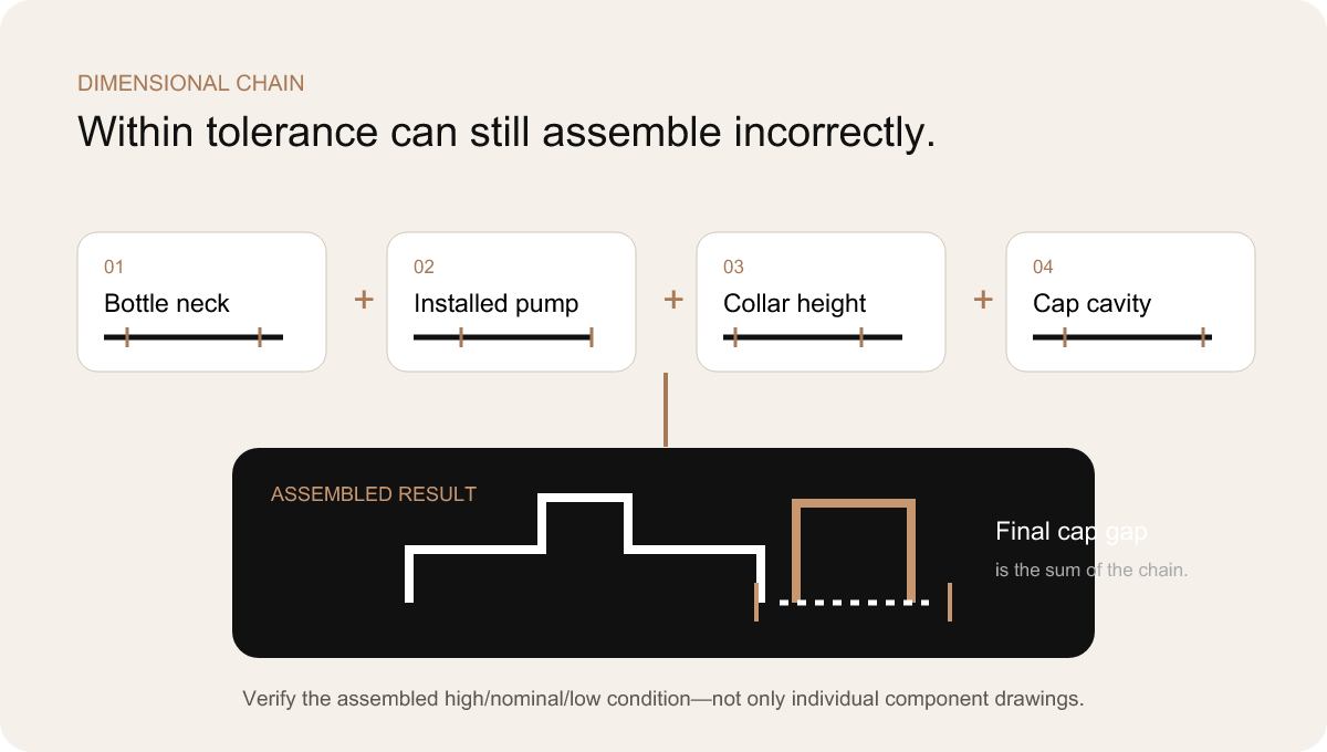
Assembled dimension chain. Individual compliance does not guarantee a controlled final gap.
Create one metallic gold across unlike materials
“Use the same gold everywhere” is a brand requirement, not a production instruction. Gold on a plastic cap, plated zamac piece, anodized or coated aluminum collar, hot-stamping foil and printed ink is created by different materials and optical mechanisms. Even when every supplier receives the same digital color reference, the physical results can diverge.
The substrate changes how light returns to the viewer. Brushed aluminum produces directional highlights. A glossy plated surface acts almost like a mirror. Metallized plastic carries the texture and geometry of the molded part beneath it. Foil is thin, flat and strongly affected by the surface it is stamped onto. Coating thickness, metallic particle orientation, gloss and texture further change the perception. A match under one light can separate under another viewing angle.
The practical response was a reference chain: digital direction → physical process samples → approved master → production comparison. The digital target remained useful for communication, but it could not serve as the only release standard. Representative parts were viewed together under the same lighting, at the same orientation and beside black, white and clear bottles. The goal was coordinated appearance, not the impossible claim that different substrates become optically identical.
One component had to anchor the visual intent. Depending on the project, this could be the cap, collar or decorative foil. Other processes were tuned toward it. If exact alignment proved unrealistic, the team could adjust gloss or deliberately separate the finishes so the difference looked intentional. A slightly satin cap and bright foil can coexist if their hierarchy is controlled; two near-matching glossy golds often look like an error.
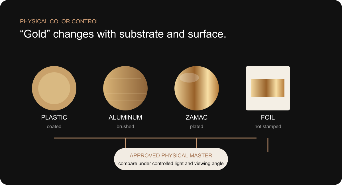
One gold intent, several optical results. Each material is tuned through a physical sample and judged together.
Matte black and matte white are not simple color selections
Two bottles can carry the same nominal black color and look unrelated when placed together. One absorbs light with a dry, velvety surface. The other produces broad satin highlights. A third reveals uneven gloss at the shoulder or appears gray where the coating becomes thin. Pantone alone does not describe those differences.
Premium matte control includes gloss level, micro-texture, coating thickness, opacity, substrate influence, curing and handling behavior. Clear glass underneath can make a thin black coating appear less deep at edges. White may require enough opacity to prevent a cold or translucent cast. Curved shoulders catch directional light differently from flat panels. The larger capacity may show more surface variation simply because it presents a broader field.
The black and white programs were therefore sampled on representative bottle geometry, not only on flat color chips. The review considered how the finish moved from front panel to corner and shoulder, whether the base edge remained clean, whether decoration achieved sufficient contrast and whether fingerprints changed the shelf impression. Gloss was evaluated side by side under fixed light rather than described with subjective words such as “soft” or “luxury.”
Consistency did not require black and white to behave identically. White may need a different coating build to achieve opacity; black may reveal handling marks more strongly. The system requirement was that each finish meet its approved physical standard and that both communicate the same intended quality level.
These decisions were connected to bottle decorating and finishing. Logo process, foil adhesion, print opacity and masking depend on the finished surface. Coating cannot be approved in isolation and then assumed to accept every decoration unchanged.
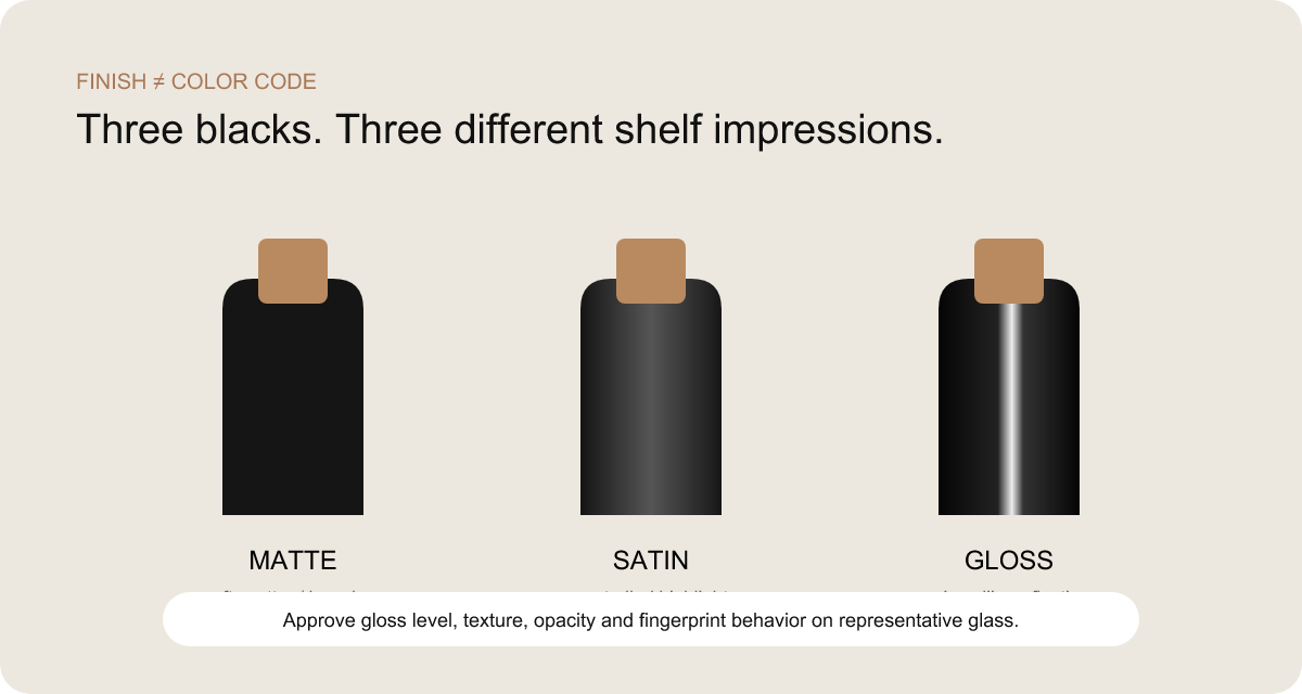
Finish is part of color. Gloss, texture, opacity and reflection determine whether two black bottles belong together.
Manage artwork as a quality characteristic
Artwork mistakes are often treated as administrative errors. In a multi-SKU perfume collection, they are product-quality failures. The wrong fragrance name on a correct bottle cannot be inspected into acceptability. A back panel assigned to the wrong market can affect compliance. A logo placed slightly higher on one capacity can disturb the entire shelf line.
Email threads are not a control system. File names such as “final,” “final-new” and “final-approved-2” do not establish which artwork belongs to which capacity, finish or market. The project required a matrix linking one SKU code to bottle size, finish, front file, back file, decoration process, revision and approval state. A production file could be released only when the row was complete.
Artwork positioning used design rules rather than independent visual guessing. The logo could align to a defined optical zone measured from a stable bottle feature. Text size might remain constant across capacities, or scale within a controlled range, depending on the brand system. The important point was to define the logic. Copying one absolute dimension to every bottle can look wrong; centering each artwork by eye can create drift.
The matrix also separated content approval from process feasibility. Brand and regulatory teams approved the words and hierarchy. Decoration trials confirmed line weight, foil transfer, ink opacity, registration and adhesion on the actual surface. A correct PDF does not prove that fine metallic lines can repeat on a curved matte bottle. Both approvals were needed.
Before production, visual confirmation assembled the row: bottle rendering or photo, finish, front and back artwork, process layers, revision and SKU code. That step was not decorative project management. It gave purchasing, production, inspection and packing the same product identity.
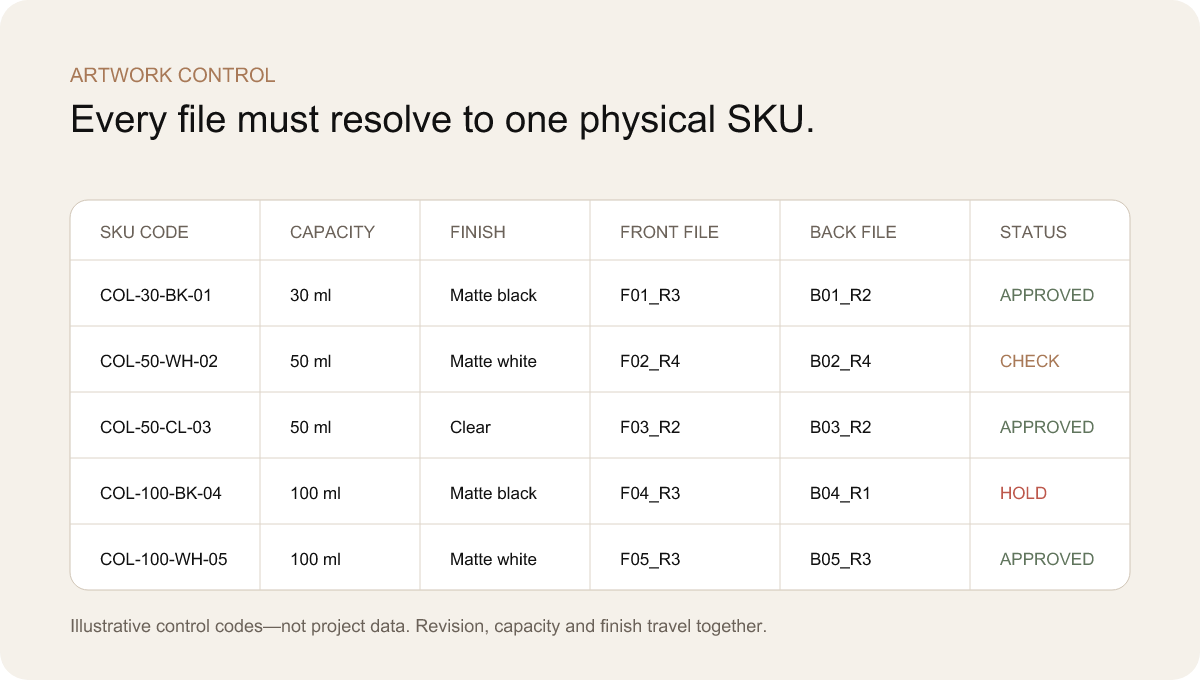
Illustrative control matrix. The codes shown are examples, not customer data. Each file resolves to one capacity, finish and approval state.
Do not sample every combination before the rules work
A multi-SKU program can consume budget and calendar time if every possible combination is produced at the beginning. That approach creates many samples but little learning. When a finish, cap interface or artwork position changes, the brand may need to repeat the same correction across an entire sample set.
The alternative was representative approval. Early samples were selected to challenge the system: a capacity that best exposed proportion, a large surface that revealed coating variation, a small bottle that tested logo space, a black bottle that challenged gold contrast, a white bottle that tested opacity, and an assembled closure that represented the most sensitive cap gap. Each sample had a written question.
Geometry was reviewed before decorative variety. A first bottle or mold-representative sample could establish body proportion, neck relationship, standing behavior and closure envelope. Engineering adjustments were made while fewer downstream decisions depended on the shape. Finish trials then compared black, white and any clear reference under controlled light. Assembly tests joined bottle, pump, collar and cap. Artwork trials established line weight and position. Only after those rules were stable was the remaining SKU set applied.
Representative approval did not replace final SKU confirmation. Every fragrance still required correct identity, copy and artwork assignment. Any capacity with unique geometry needed dimensional and assembly review. Any finish or process not represented in the approved set needed its own physical evidence. The strategy separated questions that can be answered once for a family from questions that must be answered for every SKU.
This made sampling commercially intelligent. A sample was useful when it retired a risk or forced a decision. A beautiful sample that merely repeated an already approved condition added less value than a deliberately difficult sample that exposed an interface before production. The team’s sampling tracker therefore recorded the question, evidence, decision, responsible approver and effect on other SKUs.
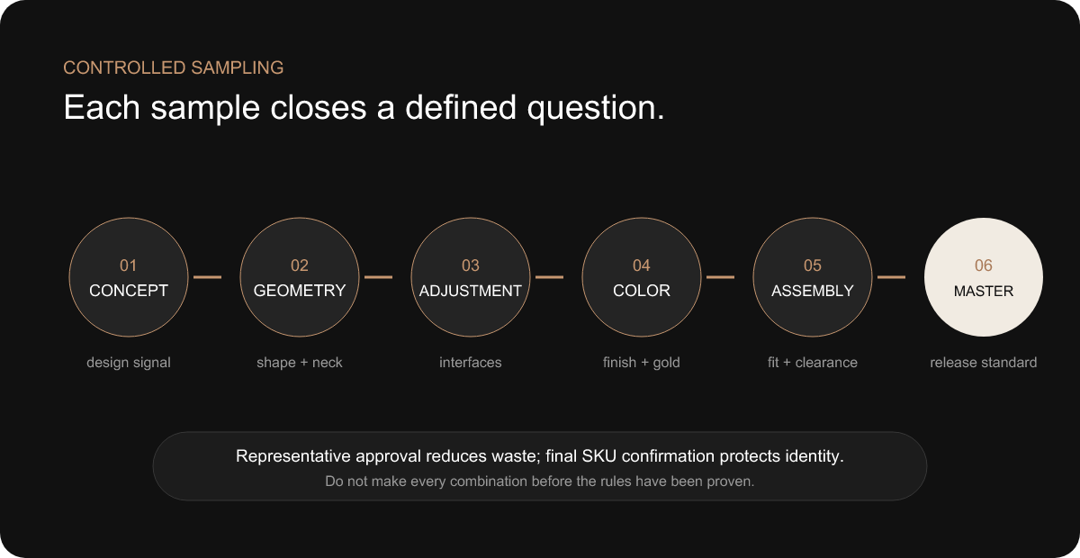
Controlled learning. Representative approval establishes the rules; final SKU confirmation protects every product identity.
Build a master-sample system, not a folder of photographs
Some packaging attributes can be controlled well by drawings and digital files. Capacity, critical dimensions, artwork paths and SKU codes belong in documented specifications. Other attributes—matte texture, metallic reflectivity, tactile cap fit and the visual relationship of an assembled package—lose important information when converted into a photograph.
The master-sample system connected both kinds of evidence. An approved clear bottle represented acceptable glass appearance and geometry. Black and white finish masters represented color, opacity, gloss and texture. A gold master anchored the cross-material visual target. An artwork master established position, scale and process behavior. An assembled master showed cap fit, collar exposure and the approved overall relationship.
A physical object without a revision is ambiguous. The sample therefore had to be labeled and linked to controlled drawings and artwork. Likewise, a drawing without the approved object could not communicate every sensory attribute. Together they formed the release standard: what the component is, what it should look and feel like, and which version has authority.
For a multi-SKU collection, the hierarchy prevented sample multiplication. One black finish master could govern several artworks if the substrate and process condition were equivalent. One assembled closure master could establish the preferred gap, while size-specific assemblies verified that the family achieved it. The master was a control node, not a museum piece.
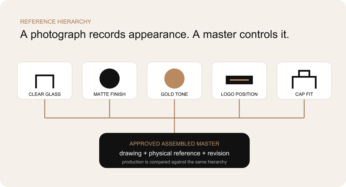
Reference hierarchy. Physical masters carry surface and assembly information that photographs cannot reliably preserve.
Optimize MOQ across the package—not one component at a time
Different packaging processes have different economic batch logic. Glass production, coating, printing, pumps, molded caps, plated metal parts and cartons may each require a different minimum quantity. Treating every SKU as independent can turn a manageable collection into excess inventory: each fragrance carries its own bottle batch, cap batch, decoration setup and carton run.
MOQ optimization began by looking for hidden commonality. If several SKUs shared a bottle mold and neck, undecorated glass could be planned as a family. A common pump, actuator and collar reduced the number of component orders. A shared cap architecture concentrated tooling and finishing volume. Fragrances could differentiate through artwork and selected surface programs instead of multiplying every structural part.
Color batching also mattered. Producing all matte-black bottle variants in a controlled sequence can be more efficient than treating black as a separate micro-order for each fragrance. The same logic can apply to white. Decoration and artwork still divide the batch into SKUs, but the upstream finish is planned across the collection. Whether this is commercially and technically possible depends on the actual process route and must be confirmed with suppliers.
A phased launch was another option when demand was uncertain. A brand might establish the full architecture but release the hero capacity first, adding travel or larger formats after market learning. This approach is valuable only if the first SKU is designed with future interfaces in mind. A first bottle that locks the brand into a unique neck, cap or carton logic may make later expansion more expensive.
The cheapest individual component was not automatically the lowest-cost decision. A lower-priced pump with a different installed height could require a new collar and cap insert. A low-MOQ cap from another source might introduce a second gold process and a new inspection standard. Total project cost includes tooling, samples, setup, quality control, excess stock, coordination, freight and the risk of delay.
Invest in the features that carry recognizable brand value
Tooling is not a badge of seriousness. It is an investment that should create a meaningful and repeatable advantage. A custom bottle mold can secure a distinctive silhouette, weight distribution or proprietary design language. A custom cap can create a memorable tactile object. But opening tooling for every capacity and component before the collection architecture is proven can lock cost into features the consumer barely notices.
The project compared three routes. A stock bottle family offered the fastest path to validate finish, artwork, closure and market response. A semi-custom route combined an existing glass body with a distinctive cap, decoration or box. A fully custom route created new bottle geometry and potentially new closure elements. Each route was judged by design value, technical risk, volume, timing, future SKU plans and total package investment.
Decoration was considered before tooling where it could carry the brand effectively. Matte coating, a controlled metallic logo and a disciplined cap treatment can transform a well-proportioned existing bottle. Conversely, if the silhouette itself was the brand’s primary signal, decoration could not replace a custom mold. The question was not “Can this be customized?” but “Will this customization improve consumer recognition enough to justify its interfaces and production obligations?”
Tooling decisions were also sequenced. A custom outer cap should not be finalized before the pump platform and installed height are known. A new carton insert should not be tooled around an idealized rendering. Bottle molds across capacities should share a family review so that the second mold does not reveal a proportion rule missing from the first.
Run work in parallel without ignoring dependencies
A completed perfume package depends on processes with different clocks. Glass may require mold preparation and a production window. Coating follows approved glass. Decoration follows the correct coating. Pumps and caps can proceed in parallel once interfaces and finishes are approved. The retail box depends on stable finished dimensions and final artwork. Assembly, quality control and shipment wait for all required streams.
The project schedule therefore distinguished between work that could begin early and work that would create rework if released early. Pump sourcing could start once the neck and dosage direction were stable. Cap engineering could progress with the installed pump envelope. Color trials could use representative glass. Carton graphic design could develop in parallel, but structural tooling and final insert dimensions waited for the finished bottle and cap.
The critical path was the longest chain of dependent tasks required for shipment, not simply the component with the longest quoted lead time. A cap might take longer to produce than artwork, yet slow artwork approval could still delay decoration and cartons. A bottle mold could be complete while a late pump change reopened collar and cap decisions. The schedule needed visible owners and approval dates, not one optimistic delivery promise.
Sequencing also protected metallic and matte consistency. Components using related gold finishes were sampled and compared before separate bulk processes ran. Black and white coating batches were planned with reference availability. Pre-production meetings confirmed which artwork revision, master sample and component lot controlled each stream. When dependencies were explicit, parallel production saved time without turning uncertainty into inventory.
No universal project duration is claimed here. Timing varies with stock versus custom routes, tooling complexity, number of capacities, sample feedback, decoration processes, production capacity and logistics. The buyer should request a dependency-based schedule that shows when their decisions are required and which unresolved item controls the launch.
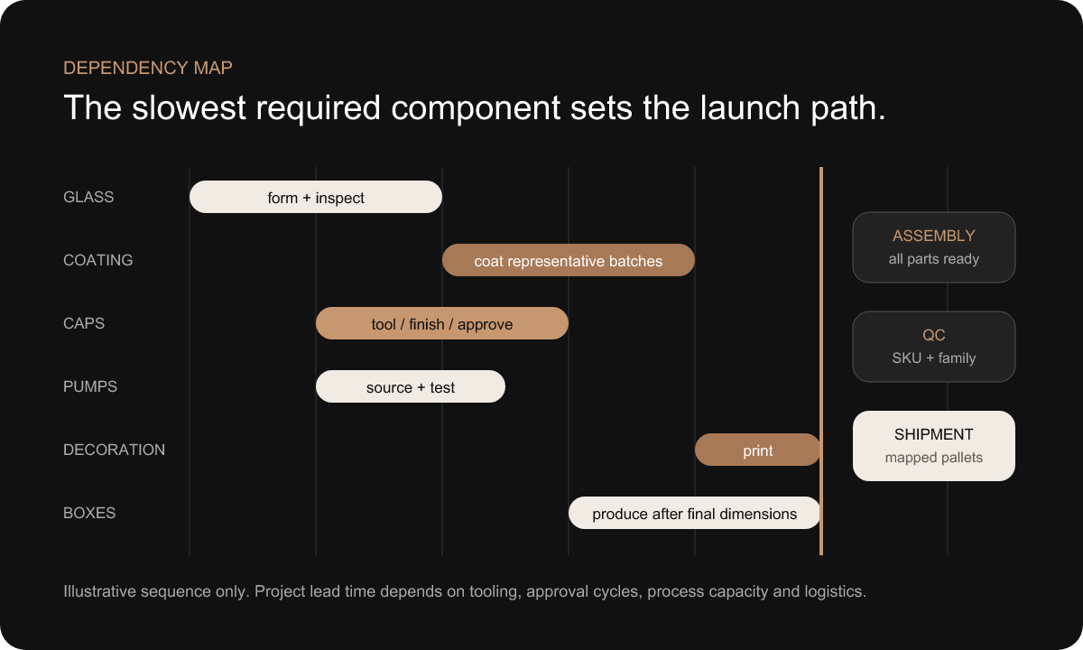
Illustrative dependency map. Streams can run in parallel, but final assembly waits for every required component and approval.
Inspect each product—and the collection between products
Traditional inspection asks whether one item meets its specification. A multi-SKU collection adds a second question: do separately acceptable items remain consistent when compared with one another? This difference between individual product quality and collection-level consistency was central to the control plan.
Each SKU still required its own checks: correct bottle and capacity, finish, artwork identity, pump and cap fit, decoration position, packing configuration and required functional characteristics. A “golden SKU” could not represent everything. The white 30 ml bottle might pass while a black 100 ml bottle carried the wrong back file or an unacceptable cap gap.
Horizontal comparison then examined relationships. Black bottles from different capacities were placed together to compare gloss and depth. White bottles were reviewed for opacity. Caps and metallic decoration were judged under the same light. Logo position was viewed across the shelf baseline. Assembled cap gaps and shoulder relationships were compared between sizes. These checks found drift that component-by-component inspection could overlook.
Inspection references followed the same hierarchy established during sampling: controlled drawings and files for measurable or identifiable attributes; physical masters for sensory and relational attributes. Photographs supported records but did not replace the approved objects. The quality team also needed access to the SKU matrix so that the correct product identity was treated as a quality characteristic.
DAXIN’s public quality management capability provides the company context. Project-specific inspection stages, equipment, acceptance criteria and results must be confirmed from records before they are claimed in a published case. This draft deliberately avoids a pass rate, test standard or rejection statistic.
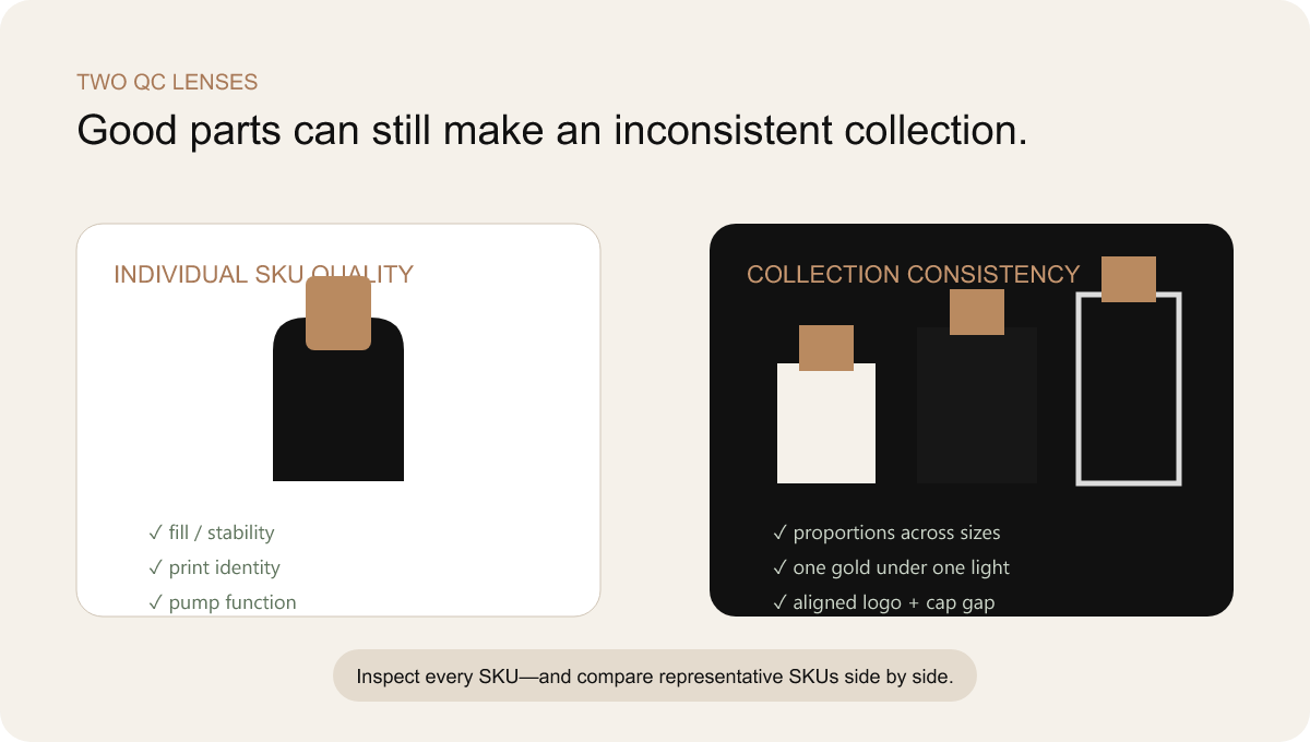
Two quality lenses. The collection is inspected vertically by SKU and horizontally across capacities, colors and shared components.
Prevent the correct products from becoming the wrong shipment
Multiple SKUs introduce a final family of risks after manufacturing is complete. Bottles with similar silhouettes can be confused before decoration. Finished products can enter the wrong cartons. Separate pumps, caps or collars can be packed in quantities that do not reconcile with bottles. Mixed pallets can arrive without a map. A replacement quantity can be absorbed into the main count and become invisible.
Carton identity therefore carried the controlled SKU code, description, quantity, component state and revision where appropriate. Labels were readable on more than one side so warehouse teams did not need to rotate every carton. Where several finishes looked similar through protective wrapping, color or code cues helped prevent selection errors without replacing the formal label.
Pallet maps linked carton positions to the packing list. This was particularly useful when the customer or filler needed a planned unloading sequence, when markets or fragrances shared a container, or when replacement units were separated. Mixed pallets were treated as a deliberate configuration rather than an improvisation at loading.
Protection was designed around the finished decorated surface. Dividers, sleeves, trays and cartons had to prevent glass-to-glass contact, cap abrasion and pressure on vulnerable decoration. A package that is safe as clear glass may scuff after matte coating or metallic printing. Retail boxes also needed protection from crushing and friction during export.
An excellent bottle delivered in the wrong SKU carton is still a failed project. Logistics control therefore used the same matrix as artwork and production, closing the chain from digital identity to physical shipment. DAXIN’s delivery and warehousing support is the natural internal resource for buyers evaluating this stage.
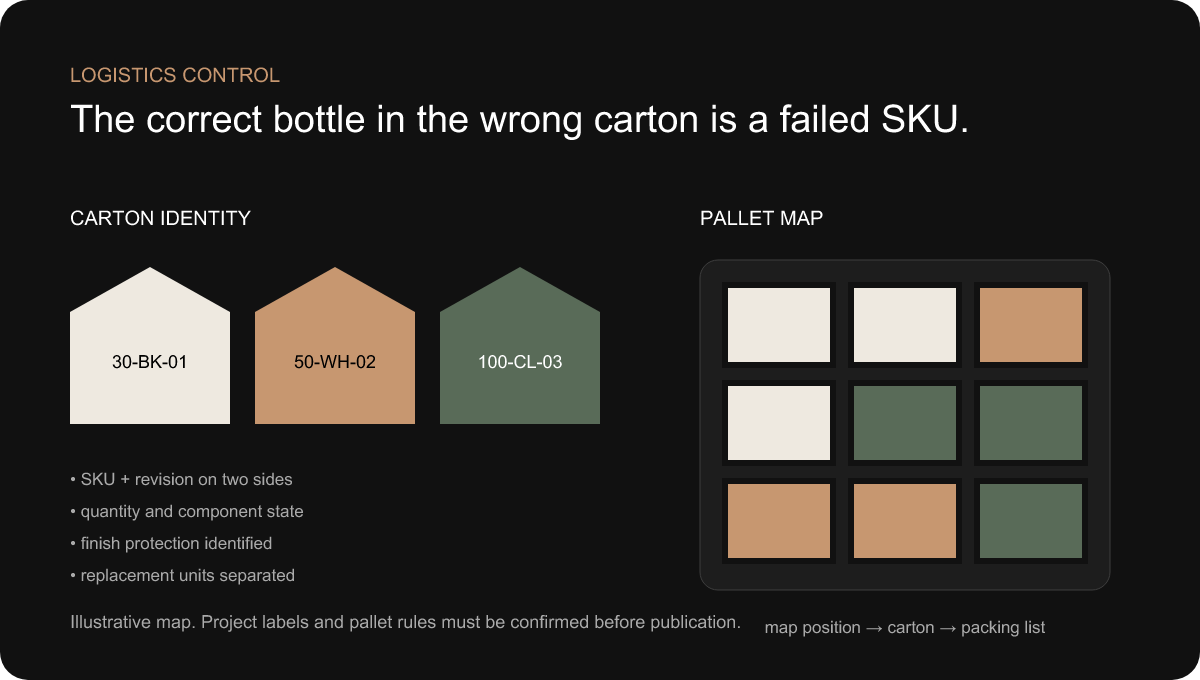
Illustrative logistics control. SKU identity follows the product through carton labels, pallet positions and the packing list.
The outcome was an architecture that could be repeated
The final solution was not defined by one dramatic component. Its value came from controlled relationships: a related bottle family across capacities; a standardized neck and pump platform where compatible; a coordinated collar and cap envelope; physical standards for black, white and gold; artwork linked to a SKU matrix; staged sampling; master references; synchronized production streams; collection-level quality checks; and mapped export packing.
This architecture preserved visible variation. Fragrances could use different names, copy and selected surface treatments. Capacities could be proportioned for their roles. Outer packaging could support different retail stories. Yet the hidden mechanical platform and approval language remained stable enough to keep the family coherent.
The integrated system also made iteration more useful. If a gold comparison failed, the team knew which reference anchored the decision. If a cap sat high, the tolerance chain identified the dimensions and components involved. If artwork changed, the SKU matrix showed every affected output. Problems became traceable decisions rather than general requests to “make it match.”
The conceptual image below visualizes that approval logic. It is not documentary evidence from the anonymized project. Before publication, DAXIN should replace or supplement conceptual imagery with verified project photographs: bottle family, physical finish samples, assembled closure, quality comparison and export packing, each cleared for customer confidentiality.

Conceptual visualization—not a project photograph. The final system connects the bottle family, closure components, finish references, drawings and outer packaging under one approval structure.
The system remains valuable after the first order
No numerical return on investment is claimed because the project records needed to support one have not been provided. The qualitative business value, however, can be described through the architecture itself.
Development complexity became more visible. The customer could distinguish a brand decision from an interface decision and see which approval affected several SKUs. Purchasing gained a clearer component map instead of treating every fragrance as a separate bill of materials. Common pumps, closure logic and finish references reduced the number of unique standards that had to be maintained.
Compatibility risk was addressed earlier. Neck, pump, collar and cap were reviewed as an assembled chain rather than discovered at final assembly. Color decisions moved from digital arguments to physical references. Artwork identity was connected to production and packing. The schedule showed dependencies, allowing work to proceed in parallel while protecting items that required a stable upstream decision.
Shelf appearance benefited because the collection was compared as a collection. Proportion, gold, matte quality, logo position and cap gaps were judged side by side. Premium consistency became a deliverable with references, not a subjective hope that separately purchased parts would match.
Future expansion became easier to evaluate. A new fragrance could enter the artwork and finish system. A new capacity could inherit the neck and closure platform while receiving a deliberate proportion study. Reorders could refer to controlled masters and revisions. The architecture did not remove development work; it prevented every addition from beginning at zero.
Supplier coordination was also simplified. Instead of asking each supplier to optimize an isolated part, one project structure defined the final assembled result. That is the difference between buying components and developing a perfume packaging solution. The value is not that every process occurs in one physical building; it is that someone owns the boundaries between processes.
Nine decisions that make a collection easier to scale
The project framework produced lessons that apply beyond one bottle style. They are useful when briefing a custom perfume bottle development partner, comparing supplier proposals or planning the next fragrance before the first launches.
The most sophisticated conclusion is also the simplest: premium does not mean maximizing variation. A collection feels premium when every visible decision appears intentional and every hidden interface works consistently. Reducing unnecessary variation creates room to execute the meaningful details better.